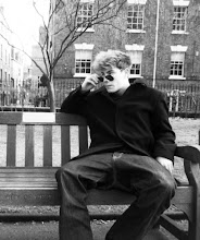
As you can see the improvements made to the poster were filling the negative space in the top left quarter in the poster by placing a tree there, and brushing around the two actors to create an effect of separation, through which I tried to insinuate ‘forbidden love’. Despite featuring the tree in the top left of the poster it does not result in the poster looking cluttered. Also, through brushing around and in between the characters, it has resulted in the poster looking less cluttered, and giving it a cleaner look. Overall, I am pleased with the progress with poster, as I have still managed to maintain the two characters being the main feature of the poster. There are improvements that I will need to make which are including all the codes and conventions of a poster which are featuring the billing box, website and the release date of the film.

No comments:
Post a Comment