Friday, 23 January 2009

DPS Analysis


How does the choice of band featured in the article suggest who the target audience will be?

The band featured in the article are The Gaslight Anthem are punk rock band, they’re music appeals to “punk, soft soul, pretty faces and yearning hearts”. Their bands main influence was Bruce Springsteen. The target audience for this article are 18+, university students, punk-rock fans, soul fans. Also it is mentioned in the article that they’re music targets a wide range of music genres and audience, as they combine soul with punk.

What type of language is used in the article? Give examples of words or phrases which are specific to the style of the magazine.

The language used in the article is formal and persuasive. There is little use of informal and colloquial language. “The following day, before an even more transcendent show at London’s ULU, Brian recalls the epiphany”.
This is an example of the formal language.
“But if experience hangs heavy on Gaslight, this isn’t dour music. Neither is it protest rock made by militant revolutionaries out tot change the world; they’re about the thrill and thunder and the chance and the righteous power of rock n roll to transcend what’s mundane”. This is an example of persuasive language that is used in the article.

How is colour used?

The colours used in the magazine are bland and neutral colours. The use of blue, white and red colours shows that the band is patriotic. Also the use of big, black font gives the punky feel to the article.

What style of text is used? Is it similar to any other pages? What does it say about the image of the magazine and the audience?

It uses standard serif, punky, and grunge. This type of font appeals to the target audience, it appeals to American people. This font links with the theme of the article and the band. The font used in this article is the same as all the other articles; however the way the page is laid out is different from the rest.

How is the double page spread laid out? How much of the pages are taken up by images and how much by text? How does this reflect the audience? What do they value?

The way the double page spread is laid out is, there is a photo of the band on the left side and on the right side there is the article. This uses the theory of z-line and also most magazines feature less important information the left side such as the photo, and the more important information on the right such as the article. The whole left page is taken up by the band and the whole right page includes the article. The way this reflects the audience and what they value is the audience would like to see a photo of the band but at the same time want information on the band and an opinion.

What tone is the magazine using when addressing the reader (as a close friend, a member of an 'in' crowd or an informed intelligent fan?) - provide evidence.

The way this magazine addresses the reader is that it uses formal language, but expects the person to be a member of an informed crowd i.e. fan. This makes the reader feel more part of the article/ social group. Also the audience are expected to be musically cultured and are expected to have good knowledge of music and a good taste. The kind of person that would listen to their music would be daring and are confident. The band’s style is raw and quite simple; they don’t have the good look boy band feel as other bands. The quote on the left page says “Unless you go out on a limb, you’re never gonna be able to get out”. This quote hints at the type of people that listen to this band all follow their trends, are quite daring and confident, not scared to be different. Also other musicians that are mentioned are not as well known today as the music industry has moved on, however the reader is expected to know all of these artists which means that the reader is expected to be musically educated. They mention musicians like Bruce Springsteen and Miles Davis a famous jazz musician.

How is the artist/band presented to the audience through the images? You may wish to carry out a textual analysis.

The way the band is presented to the audience through their images is, the main image is very casual which shows that the band has a raw and simple style. One of the members is dressed in plain jeans while the other member is showing off his tattoos. Also the background to the photo is taken in some scarp-yard or warehouse. This gives the authentic band an authentic look and this helps represent the bands style well. The photo taken off the band looks as if they weren’t ready; this gives a laid back impression.

How does the style of the article match the style of the front cover?

The article carries out the theme from the front cover and the contents page onto the article. The use of red, blue and black are the colour theme of NME. The black and the red are included in the contents, which are the two main colours used in the magazine. The white background in the article and the inclusion of blue represents the band and the American flag.

Does the article demand any prior knowledge? Give examples.

The article does demand prior knowledge of the band and also good music knowledge based around the band from different music genres such as jazz, soul and punk. The writer expects the person to be members of an informed crowd i.e. fan. This makes the reader feel more part of the article/ social group. Also the audience are expected to be musically cultured and are expected to have good knowledge of music and a good taste.

Thursday, 15 January 2009

Questionairre Analysis


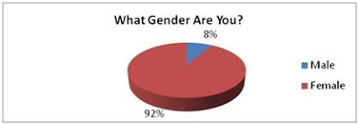
The people that I gave the survey to were predominantly females. This is due to the school as it is primarily a girl’s school. I asked this question to see what market my magazine would be targeting. The way this may affect my magazine is that they may need to make the magazine a bit more feminine as the school is predominantly female.


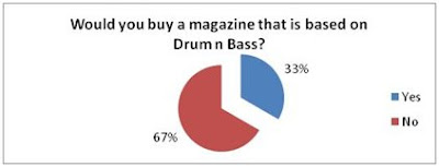
Only 67% of the people said that they wouldn’t buy a Drum n Bass magazine. I asked this question to see how big the market for Drum n Bass, and then see if it is profitable. The way this may affect my magazine is that I may have to target a minority of people, which may make it harder to sell the magazine. I could choose not to produce the magazine at all.


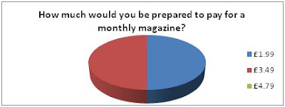
There is a 50/50 split between the people that would pay £1.99 and £3.49. I asked this question to find out how much people would be willing to pay for the magazine. Then from seeing how much people would be willing to pay I would come up with a price that is suitable and profitable.


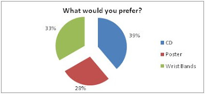
The results for this question are similar. This shows that the audience have different tastes and preferences. The impact of this on my magazine will be that we can change the free gifts given with the magazine each month as the audience like all of the gifts equally.


The results were close between all the choices I offered. This shows that the audience has different preferences. This suggests to me that I should include all these topics as there is a variety of tastes.

Tuesday, 13 January 2009

Evaluation

In what way does your media product use, develop or challenge the forms and conventions of real media products?

Most commercial magazines contain things like a masthead, cover line, a model, strap line, date line, bare code etc. I conformed to all of these of these features. However it challenged certain forms of convention such as the cover lines by having fewer cover lines compared to other magazines, with little content of writing. The price was not included on the magazine which also challenges the common conventions of a typical popular magazine. This is because; as it is a school magazine it would be free so there would be no need for a price. The table of contents conformed to a typical table of contents as it had a masthead on the top which every major magazine has. My table of contents was highly inspired by “Men’s Health”, which featured pictures with a little bit of explanatory text. I used a non-linear format/ collage, this challenges magazine conventions. This makes it more appealing for the reader.

How does your media product represent particular social groups?

The model on the front cover is a 16 year old student at St Marylebone School. This photo is a typical example of a teenager, taken the photo by a vending machine, and is also dressed informally which is therefore non-elitist. It’s not like a student being dressed in full uniform. In the table of contents, the use of the UCAS logo represents is important for year 12 and 13 students. Furthermore the iPhone photo, suggests that the institution is quite technological as it uses letters such “@” and glow around the fonts which compliments the magazines theme.

What kind of media institution might distribute your media product and why?

The magazine would be produced and distributed by a technological school which could specialise in subjects like I.T or Media. This magazine is primarily focused on the Sixth Form as its contents are mainly related to the year 12’s or 13 e.g. UCAS.

Who is the audience for your media product?

The target audience would be 16-18 year old students at Sixth Form or college. The magazine appeals to both genders.

How did you attract/address your audience?

The way it attracts its audience is it speaks to the audience indirectly as it doesn’t use words such as “you”, doesn’t personally address the audience. The layout of the magazine is formal, positive, well structured and purposeful. It doesn’t include things like student gossip or fashion advice. The table of contents uses big photos and a variety of fonts to appeal to students and also the grid separated different articles which it makes it more obvious and easier for the reader to choose where they want to go. The use of the iPhone competition will attract the readers and will appeal to them. However as it would be most likely that the first page the student would turn to would be the iPhone competition. So I think including a button or a plug on the front cover and placing the photo in a more obvious place in the table of contents to attract the readers and stand out as it is quite discreet.

In the process of constructing this product, what have you learnt about the technologies employed?

The new skills I have learnt I have detailed the skills I have learnt such as cloning, cropping, glow styles, layering, air brushing, colour filtering etc. Look at previous blog entry for more details.

Monday, 12 January 2009

Preliminary Task


Media Blog
Image Analysis:


This is an image of the new James Bond that is going to be released. It has the title of the film, which is ‘Quantum of Solace’ and features the main character, Daniel Craig, starring as James Bond. Also the trademark Aston Martin is featured in the background. The mise en scene is denoting the back streets, with a Mediterranean feel. There is an Aston Martin in the background with a dead body in front of the car; James Bond is the main character of the image holding a gun. The connotations of the image are Bond, holding a gun, which gives the audience the impression, “Bond is back with a vengeance”. The photo seems to be taken in a Mediterranean city, as the narrow streets are very symbolic of cities in Italy, France, and Spain etc. This photo is a long-shot taken at eye level; this shot makes the body in the background look insignificant. The title ‘Quantum of Solace’ is not a revealing title; ‘quantum’ is a fictional terrorist organisation, while ‘solace’ means comforting soothing. Relating the two meanings is not very clear, and how the two definitions can be linked.

Colour Filtering/Colour Popping:


Colour filtering is when a certain colour is made to stand out against the others. We learnt how to use this technique in the second lesson. This is useful for example when you design posters and want to contrast multiple things. This makes the audience looking at the magazine it makes them concentrate on a particular thing in the image. To do this, we opened Adobe Photoshop and changed the hue/saturation down to -60. Then I selected the brush tool, and then the colour correction tool. Then I’d go over part of the photo that I wanted to be in colour. The image would then result a certain part of the image stands out from the rest. The Barack Obama photo shows Obama’s face in colour with the rest of photo unsaturated. This helps make his face stand out from the rest of the photo.

Fonts:

In our third lesson we talked about fonts and their importance. We discussed about serif fonts and sans fonts. Sans fonts are better for titles as they are more legible. They are more eye-catching. However sans is not appropriate for longer texts as it is not as clear to read. Serif fonts are not good for posters or titles, but are better for long texts as they are easier to read.

We downloaded our fonts from the website called http://www.1001freefonts.com/.


This photo of Barack Obama uses a variety of Photoshop techniques, such as blurring the background so he is the centre of attention in the photo. Also the font emphasises his patriotism, the font is very simple and straight to the point which is suggesting that Obama is a strong presidential character. The colour of the text is also important, the colours in the image are red, white and blue which symbolises America.

Skins Advert - Colouring Effects:


In our next lesson we learnt about colouring effects. We opened the photo we wanted on Photoshop and selected the “soft light” effect. Then I selected the brush tool and went over the photo with different colours. The soft light made the colours in the image less strong and more faded. Then we added Gaussian blur to -60 which made the different blend in with each other more.

Airbrushing:


In the next lesson we learnt how to do air-brushing. I wanted to change the eye and hair colour using this technique. We first open up Adobe Photoshop and duplicated the image and then applied Gaussian blur of -15. Adding this blur removes any skin blemishes and makes the skin look smoother. For the hair I then selected the brush tool and used the soft light effect and hue. I coloured over her hair with red and the colour of her hair then changed to red.

Cloning:


In this lesson we learnt how to clone part of an image. To do this technique, I simply selected the clone stamp tool and then held “alt”. Then I released the “alt” button and went over part of the photo with the brush of where I wanted the image to be cloned.

Signs and Semiotics:

In our next lesson we learnt about signs and semiotics. There are 3 kinds of semiotics:

· Icon – Look like what they represent
· Symbol – Need to be culturally learned. They do not look like what they represent
· Indexical – Suggestive and connected to what they represent


A no smoking sign would count as an icon as it looks like what it represents.


A Nike tick would be symbolic, as you would need to be taught as to what it means.


The photo of the smoke is indexical, as it shows that smoke represents fire.


Logo and Banners:

In our next lesson we learnt about logos and banners and created our own. We opened up Photoshop and used the A3 preset. I then used all my skills I have acquired from my previous lessons and designed my media blog cover. I used different brushes; I downloaded some brushes from http://www.brusheezy.com/.


School Magazine Cover Analysis:


In this lesson we had to design our own school magazine cover. It required me to use all my skills design this cover. I used effects such as Gaussian blur, soft light, brightness, hue, outer glow and etc. I used different fonts and layout techniques to make the magazine cover effective.

Table of Contents Analysis:


Here we were set a task to design our table of contents for our magazine. The main features and effects of our magazine just layout, fonts and photos. The table of contents didn’t need any extra effects as I wanted to have a simple but effective design.

School Magazine Analysis:


The way we analysed the school magazine is we looked at the advantages and disadvantages to the layout and the design. We used the magazine to inspire us and help us create our own school magazine cover.

The magazine has good and well laid out cover lines. However using too many cover lines will make the magazine cover look overcrowded. Also the image background has blurred out the background and made the book the centre of attention which is a technique that I have learnt how to do as well. Also the magazine has a colorful theme which is another positive aspect of the magazine.

Evaluation:

The magazine and table of contents have turned out positive, and comply with a variety of codes and conventions. However, there are areas in which I could improve both the magazine cover and the table of contents, such as the layout of the cover lines.