In what way does your media product use, develop or challenge the forms and conventions of real media products?
Most commercial magazines contain things like a masthead, cover line, a model, strap line, date line, bare code etc. I conformed to all of these of these features. However it challenged certain forms of convention such as the cover lines by having fewer cover lines compared to other magazines, with little content of writing. The price was not included on the magazine which also challenges the common conventions of a typical popular magazine. This is because; as it is a school magazine it would be free so there would be no need for a price. The table of contents conformed to a typical table of contents as it had a masthead on the top which every major magazine has. My table of contents was highly inspired by “Men’s Health”, which featured pictures with a little bit of explanatory text. I used a non-linear format/ collage, this challenges magazine conventions. This makes it more appealing for the reader.
How does your media product represent particular social groups?
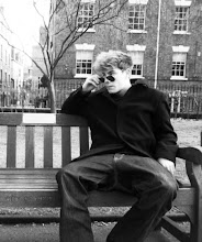
The model on the front cover is a 16 year old student at St Marylebone School. This photo is a typical example of a teenager, taken the photo by a vending machine, and is also dressed informally which is therefore non-elitist. It’s not like a student being dressed in full uniform. In the table of contents, the use of the UCAS logo represents is important for year 12 and 13 students. Furthermore the iPhone photo, suggests that the institution is quite technological as it uses letters such “@” and glow around the fonts which compliments the magazines theme.
What kind of media institution might distribute your media product and why?
The magazine would be produced and distributed by a technological school which could specialise in subjects like I.T or Media. This magazine is primarily focused on the Sixth Form as its contents are mainly related to the year 12’s or 13 e.g. UCAS.
Who is the audience for your media product?
The target audience would be 16-18 year old students at Sixth Form or college. The magazine appeals to both genders.
How did you attract/address your audience?
The way it attracts its audience is it speaks to the audience indirectly as it doesn’t use words such as “you”, doesn’t personally address the audience. The layout of the magazine is formal, positive, well structured and purposeful. It doesn’t include things like student gossip or fashion advice. The table of contents uses big photos and a variety of fonts to appeal to students and also the grid separated different articles which it makes it more obvious and easier for the reader to choose where they want to go. The use of the iPhone competition will attract the readers and will appeal to them. However as it would be most likely that the first page the student would turn to would be the iPhone competition. So I think including a button or a plug on the front cover and placing the photo in a more obvious place in the table of contents to attract the readers and stand out as it is quite discreet.
In the process of constructing this product, what have you learnt about the technologies employed?
The new skills I have learnt I have detailed the skills I have learnt such as cloning, cropping, glow styles, layering, air brushing, colour filtering etc. Look at previous blog entry for more details.
skip to main |
skip to sidebar
No comments:
Post a Comment